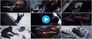
The two title sequences that I will use to compare the title placements are 'Guardians of the galaxy' (2013) and 'Deadpool' (2016). Both of these films are created by Marvel studios but with completely different teams. The timelines below shows the points in the sequence where various things come up:
Running order
'GOTG' begins with 'Marvel studios presents' as the first titles and continue in this order: 'A James Gunn film', then lead actor, love interest and rest of main cast - although the actors playing heroes are listed before those playing villains. Then the film title, casting director, music supervisor, soundtrack composer, visual effects producer, visual effects supervisor, costume designer, editors, production designer, director of photography, co-producers, executive producers, producer, writers and finally, director.
'DP' starts with the Marvel logo, then 'Twentieth century fox presents, in association with Marvel studios... Some douchebag's film.' From there the order is lead actor, love interest, villain, other cast, producers, writers, director and finally the title of the film. As a parody of usual title order this shows us the typical order, which is mainly followed by 'GOTG' as well as by most other films.
Placement of titles
'GOTG' consistently places the titles opposite to Chris Pratt's character - if he's on the right of the screen the titles will be on the left, either in the top corner, middle of the left side or the bottom-left corner, and vice-versa if the character is on the left. The exceptions to this are 'a James Gunn film' and the film title itself, which are both in the centre of the screen to give the more prominence.
'DP' is very different, as the titles are placed into the scene as if they are objects in the still frame the camera is exploring. Each title is placed against a background that helps it stand out, drawing attention to them. Since the camera is moving, yet the titles are static in the film's environment the titles do not have a fixed position on screen like the 'GOTG' titles, but the camera moves over each title in a way that gives it prominence for a second or two before moving on.
Timings
The timings are consistent in 'GOTG' other than a long pause before the title. 'DP' has very inconsistent timings, due to the camera focusing on certain aspects of the frozen scene for longer than others.
Style/ Font
The font used in 'GOTG' is sharp, yellow and fits in with typical science-fiction font as it reminds the audience of films such as star wars and star trek with it's clean, square-based (E.g rounded parts of letters are flattened to make them more square like) design. The yellow colour hints at the light comedic tone of the film. 'DP' uses a humourless, thick grey font that is also square based. The grey font contrasts with the exciting, colourful scene shown and also juxtaposes what the titles themselves are saying for comedic effect. The title of the film itself is diagetic and contained in the film world as a word written on a piece of paper in handwriting, to signal the transition from the titles into the more natural film world.


Ray, you have posted two very good pieces of work on Sound and Titles comparisons, showing very good understanding and including some good technical detail. However, particularly for Hw task 2b you have missed the opportunity to extend your analysis and to provide more detail which are requirements for Level 4 at AS Level. Please add a timeline to 2b please as is outlined on p 12 in the folder.
ReplyDelete